Otto
School
Shillington College
Project Type
Branding, Experience Design
Overview
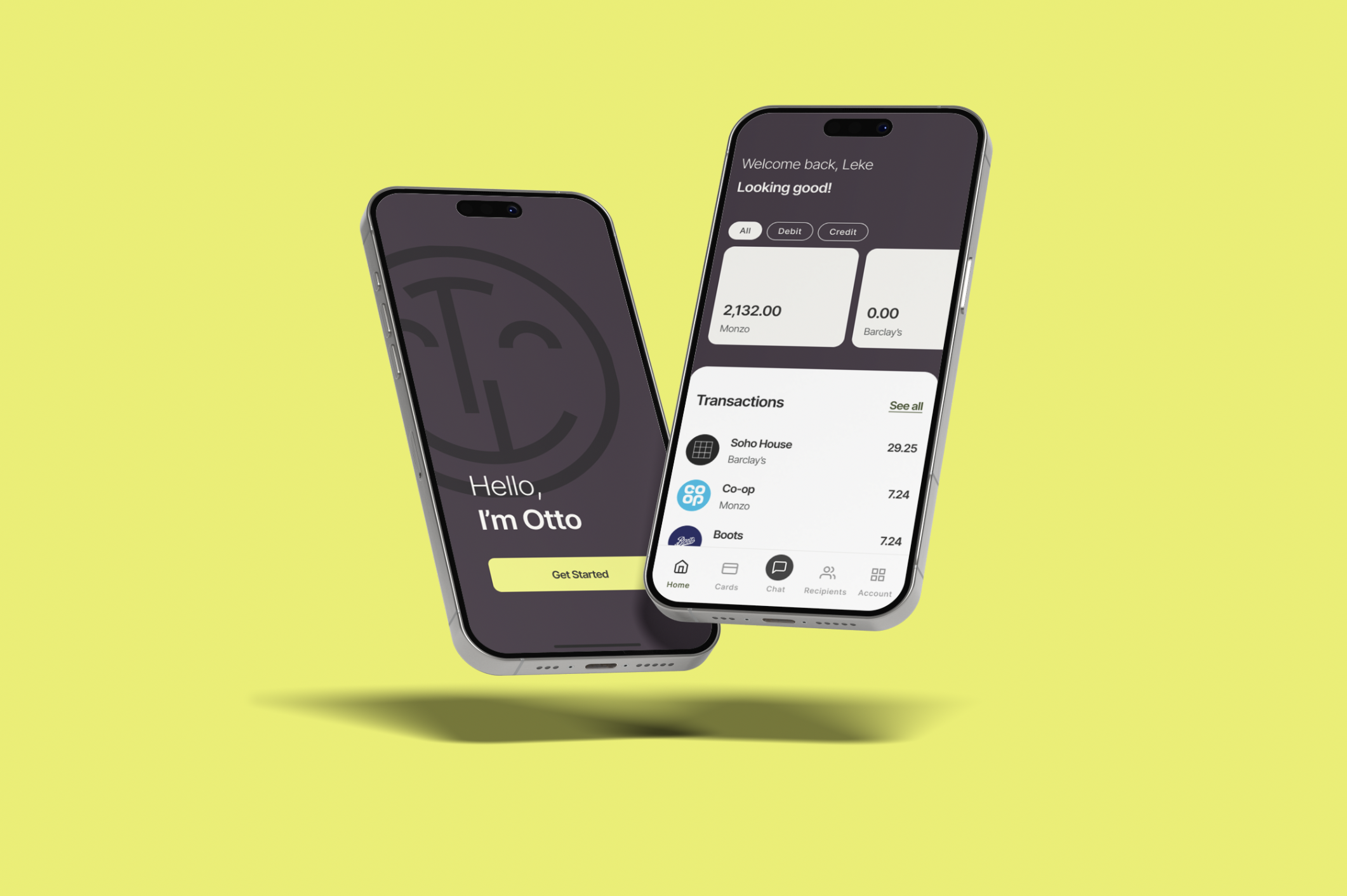
Visual identity and experience design for a personal finance app that helps users monitor multiple accounts.
Otto, named after the inventor of the first commercial bread slicing machine, is the best thing since sliced bread. Chat to him for actionable recommendations for improving your financial health.
I explored a number of design routes, including…
Concept 1: Apiary
Aspiration, community, individuality.
Inspiration: Silicon Valley as a human beehive; a vibrant community of hardworking entrepreneurs, each creating something unique yet contributing to a larger ecosystem.
Visual Approach: Explored designs inspired by the structure of beehives, honeycombs, and bees, symbolizing collaboration and individual creativity. Concepts included geometric patterns, bee-inspired shapes, and typography reflecting interconnectedness and industriousness.
Concept 2: Otto
Ambition, innovation, individuality.
Inspiration: Otto Rohwedder, the inventor of sliced bread, with the app being likened to "the best thing since sliced bread" in the brief.
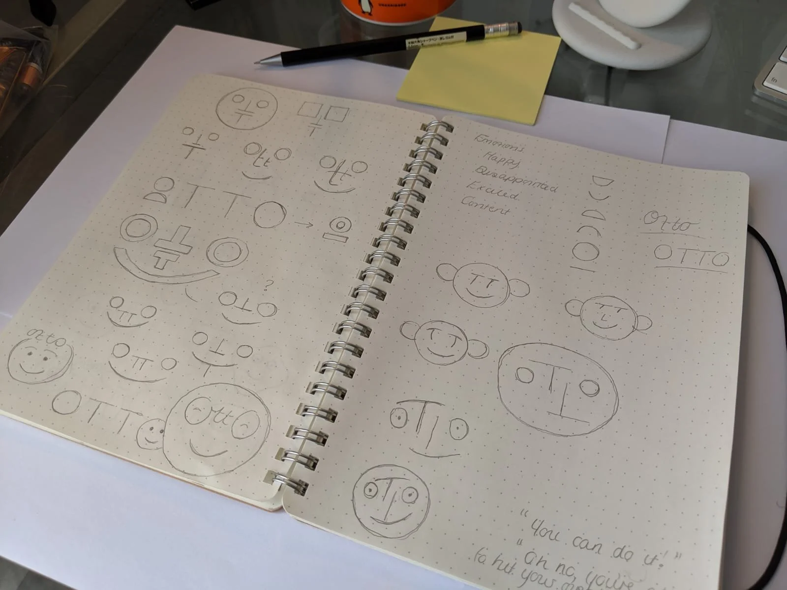
Visual Approach: Playful, approachable visuals. Explored how I could humanise “Otto” in the logo design and circular forms from the brand name
Logo Design
After pitching a number of different routes, the chosen logo used the letters of the chosen brand name; Otto. The final design was playful and dynamic, and allowed users to get a sense of their financial health at a glance.