NatWest


Role
Strategy, Experience Design
Overview
I co-led the redesign of NatWest’s new-to-bank onboarding experience, enabling customers to open an account and start using the app immediately, a major shift from the existing branch and web-based processes.
This case study looks at what happens after registration. Customers are prompted to set up their first product, personalise their app, and explore the platform’s key features and services.
Definition
To begin the project I facilitated early workshops with product, tech, and design leads.
This helped us align on the challenge, surface technical dependencies, and agree on what success would look like for both users and the business.
We also identified which features would be in scope for MVP versus later phases.
One output was this simple FigJam map showing how the new flow could connect with the existing web-based application process
Ideation and prototyping
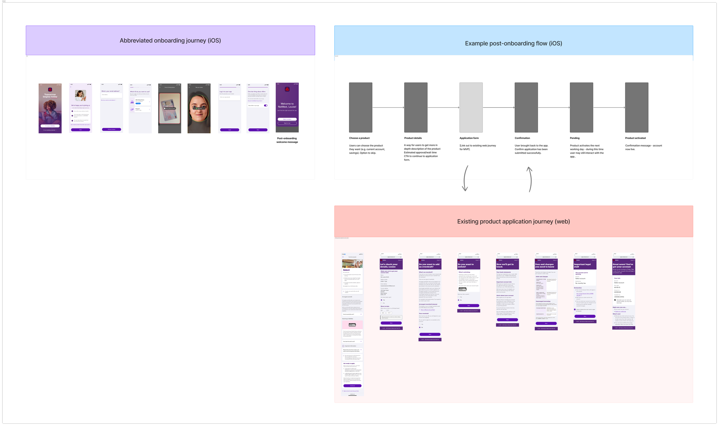
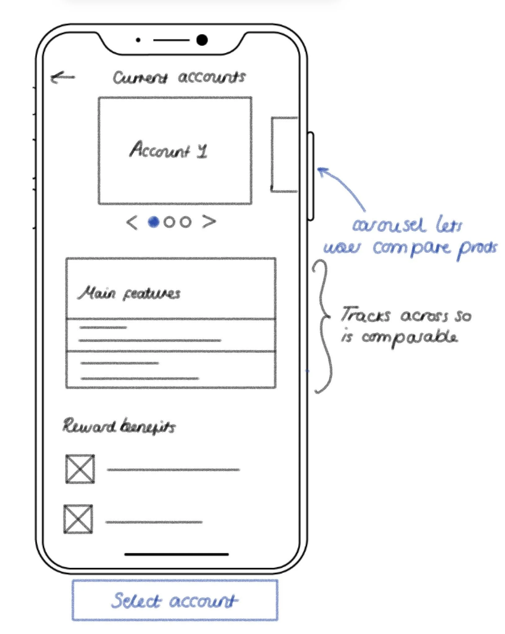
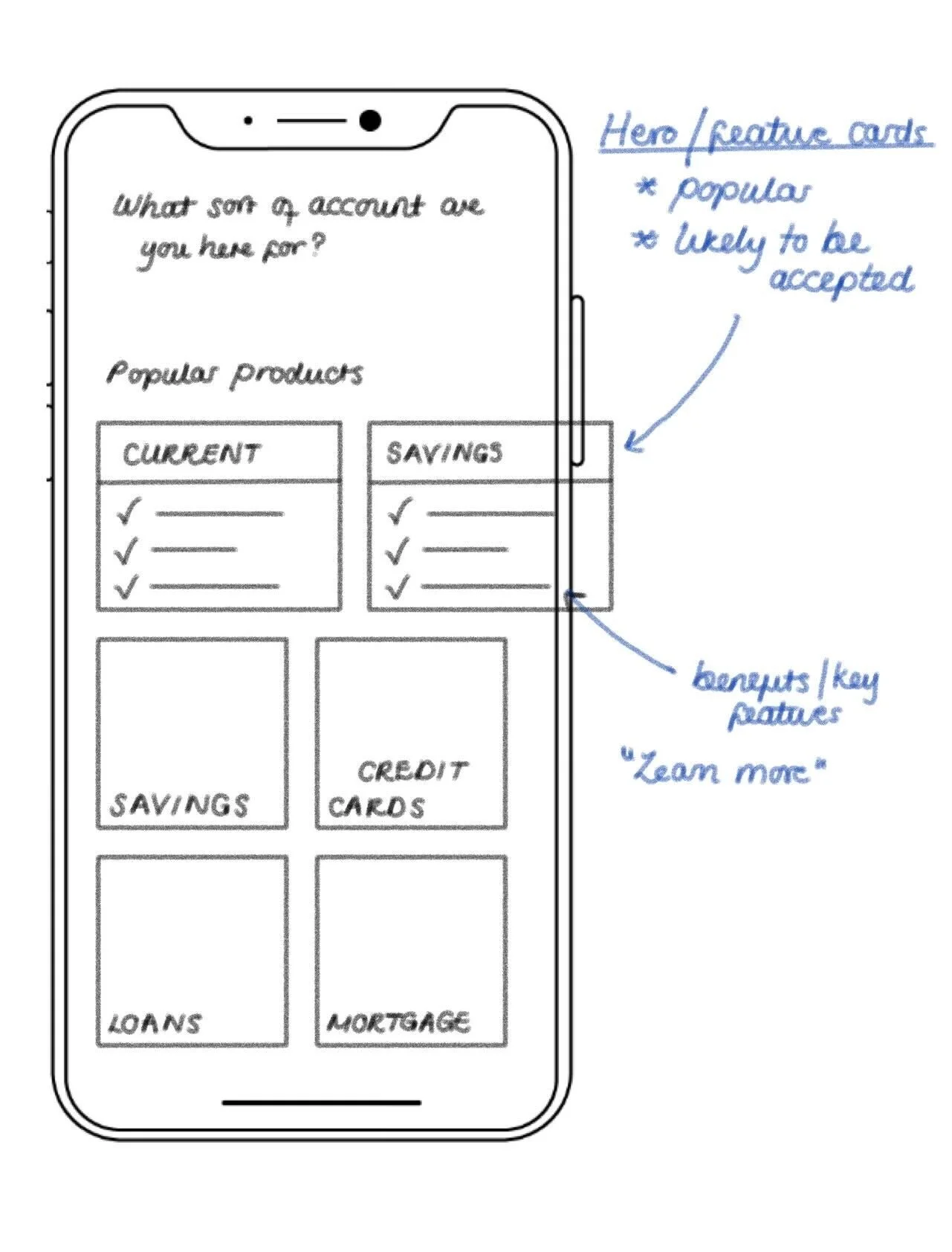
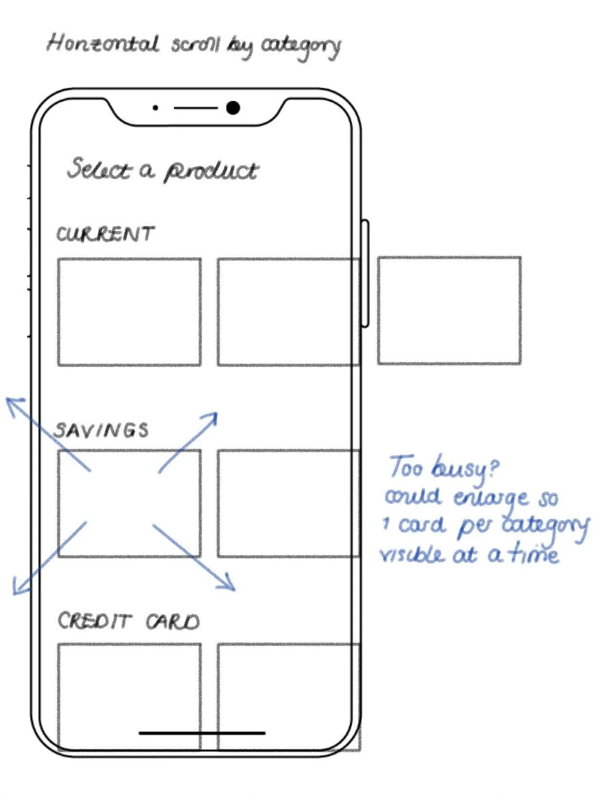
I sketched out screens for seven key user pathways within the onboarding journey, from product discovery (below) to re-engagement. I then translated the strongest concepts into wireframes in Figma.
Previous research showed most users arrived knowing what they wanted, but the business needed to highlight the broader range of products they might not have considered. I aimed to balance fast product access with subtle discovery.


Testing
I collaborated with research to plan and conduct 8 moderated usability tests of the broader onboarding journey.
Key insights:
Users viewed onboarding as two clear stages: registration and product activation.
On average, they expected to complete the entire process in under 8 minutes.

Observation room at the NatWest Research Hub
Stills from animated transition explorations
Iteration
The research insights and technical constraints (including required handoffs between iOS, web and headless content) led me to design around how users naturally viewed the process; as two separate stages.
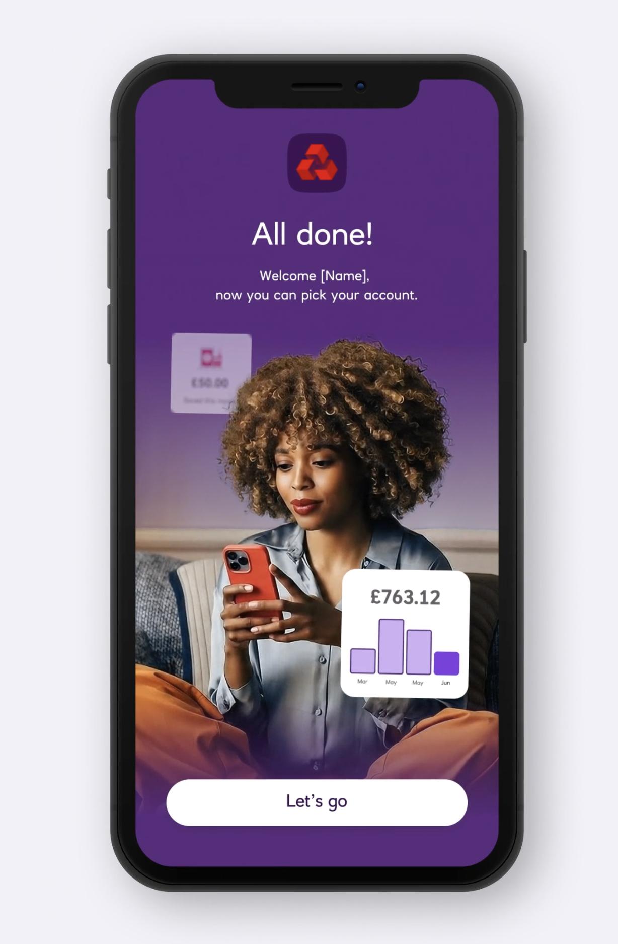
This shift created an opportunity to design a more intentional transition between registration and product application, reinforcing progress and keeping users engaged.

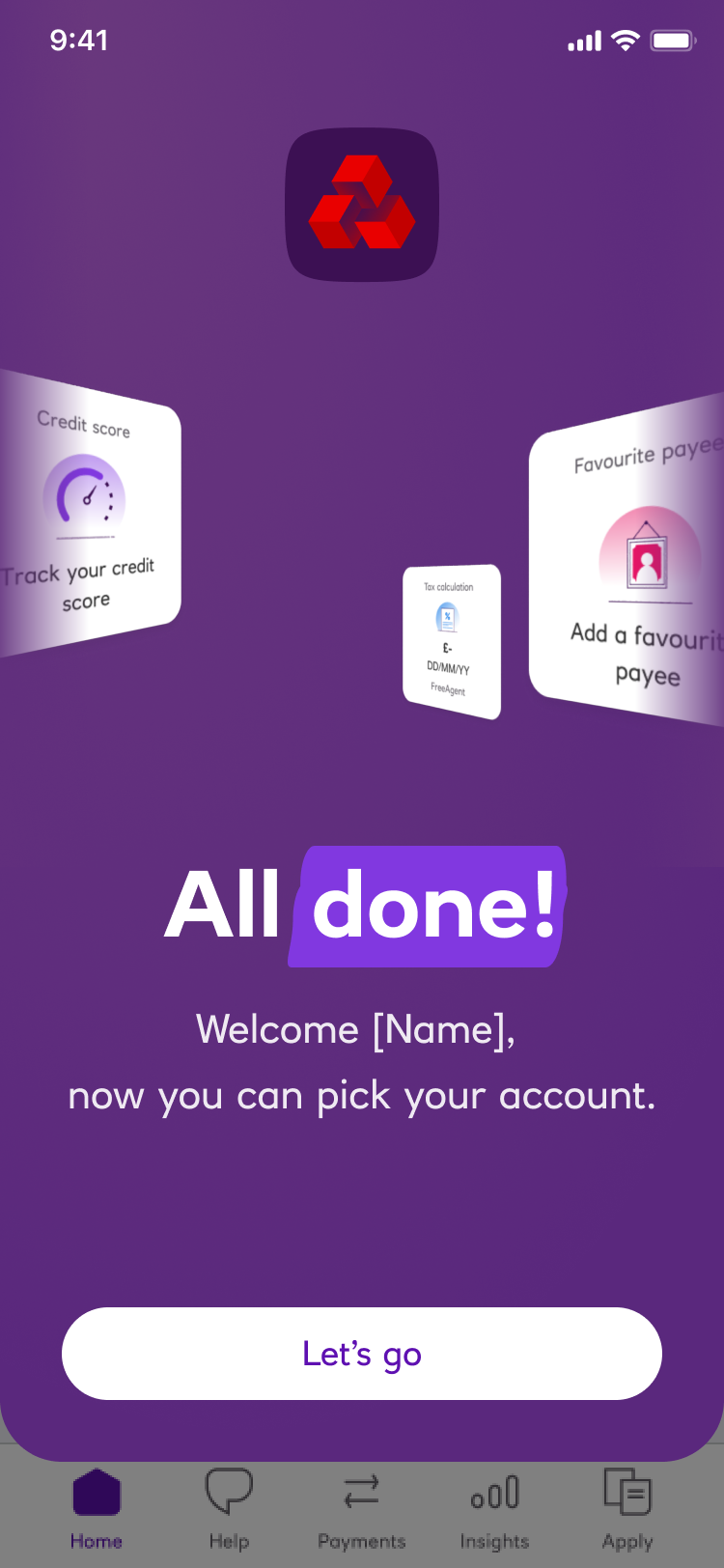
The key change was dropping users into the app after registration rather than continuing one long journey.
This created a more natural flow between iOS and web, and gave users a sense of progress after the initial setup.